Site
All the site related configurations are entered here.
Name
Name of the Site
Note: This field value cannot be changed
Slug
Unique identifier of the site.
Note: This field value cannot be changed
Primary URL
Used in links and in Xplorer site search
Note: This field value cannot be changed
Managers
List of users who can manage the site. i.e. pages, articles
Note: Once removed, you cannot add back the user. Please get in touch with the admin.
Logo
Logo displayed in Xplorer site search result
Allow Ads
Allow ads to be displayed on the site
Site Header
Site header navigation bar.
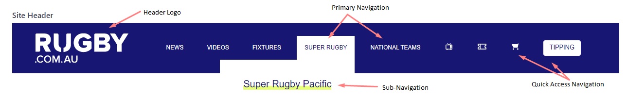
The following fields can be updated in the header field.
Header Logo
Crest/logo of the site. It is recommended to use a 'svg' file format.
Display Search
Display site-wide search. (to be implemented)
Header Appearance
The colour theme of the header navigation controls the background colour of the header component and the Navigation Items text colour.
Mobile Header Appearance
Colour theme of the header navigation for mobile devices.
Layout
There are two options, small and large. The default value is large
- The layout value should be small for pages with feature header option. i.e. australia.rugby header
Primary Header
List of navigation items. The title will be converted to uppercase automatically.
Note: You can add up to a maximum of 7 navigation items
| Field Name | Description |
|---|---|
| Title | Title of the navigation item. It is recommended to have a short text. |
| Link Address | Links destination of the navigation item. The dropdown provides all the existing pages that are available. For a custom URL, type the URL and select it from the dropdown. |
| Sub Nav | You can add up to 10 sub-navigation items. Please check the table below for field details |
Sub Nav
| Field Name | Description |
|---|---|
| Sub Nav Item | List of sub-navigation items. |
| Appearance | Colour theme of the sub-navigation item, which controls the text colour and the hover colour |
Quick Access Navigation
Quick access navigation gives you the option to have buttons and icons in the header component.
Also, the Display on Mobile option helps to display/hide for mobile view.
It is recommended to have a maximum of 5 items.
Site Footer
Site Footer Navigation far

The following fields can be updated in the site header field.
Footer Logo
Crest/logo of the site. The size of the footer logo bit larger comparing to the header logo. You can use the same asset used in the header logo. It is recommended to use a 'svg' file format.
User Header Navigation
If this field is checked, navigation items are populated using the header primary navigation list. This helps to reduce the workload and well as to maintain consistency between the header and footer primary navigation. If the field is unchecked, the navigation is populated using the primary footer field list.
Tag Line
A small sentence displayed under the footer logo.
Social Navigation
A list of social links of the site.
| Field Name | Description |
|---|---|
| Title | Social media name |
| Link Address | Links destination of the navigation item. |
| Icon | A list of available icons. Please get in touch with the admin if you require any new icons |
Footer Appearance
The colour theme of the footer component controls the background colour and the text color of the footer.
Copyright
Copyright Text
Ancillary Navigation
A list of ancillary navigation items
Primary footer
This field will displayed only when User Header Navigation is unchecked. This is a List of
navigation items as same as the primary navigation in the header component. However, the primary
navigation items wont converted to Uppercase automatically.
| Field Name | Description |
|---|---|
| Title | Title of the navigation item. It is recommended to have a short text. |
| Link Address | Links destination of the navigation item. The dropdown provides all the existing pages that are available. For a custom URL, type the URL and select it from the dropdown. |
| Sub Nav | You can add up to 10 sub-navigation items. Please check the table below for field details |
Sub Nav
| Field Name | Description |
|---|---|
| Sub Nav Item | List of sub-navigation items. |
| Appearance | Colour theme of the sub-navigation item, which controls the text colour and the hover colour |